The summary page shows the monthly statistical data. You can compare the data with the last month and check your trends in sleep rhythm, hours of sleep and snoring, etc. You can also see how your sleep has changed when you take some action to improve your sleep.
This page is available for JUKUSUI Premium subscribers, but you can use it for a 60-day free trial from the date when you start using this app.
Average data for this month
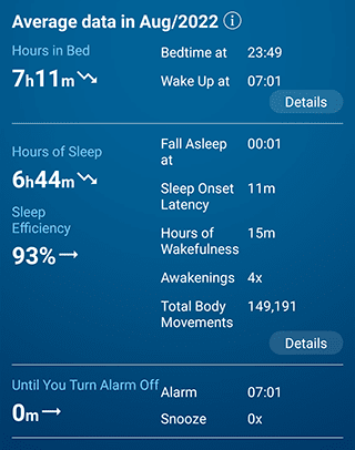
This page explains the average sleep data for the current month. The arrow symbols indicate a comparison with the previous month. If the data is increasing, the arrow will point up. If it is decreasing, the arrow will point down.
Feeling on awakening & sleep rhythm
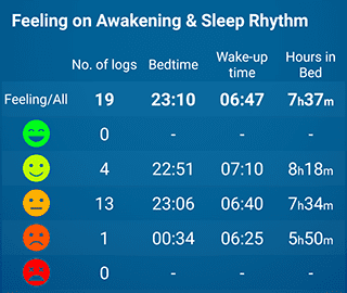
This page shows the average bedtime, wake-up time and hours in bed for each feeling on awakening. You can check what kind of sleep rhythm you wake up feeling good.
Stability of sleep rhythm
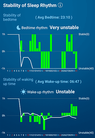
This graph shows how different the average bedtime and wake-up time are compared to the standard average.
- Bar graph (Left) indicates the deviation between your daily bedtime and wake-up time and the average time of them. The smaller the daily bar graph, the more stable the bedtime and wake-up time are.
- Line graph (Right) shows the standard deviation. The more stable it is, the higher it maintains. The more unstable it is, the lower it is.
The evaluation will be carried out with the following 5 levels:
- Very stable
- Stable
- Slightly unstable
- Unstable
- Very unstable
Hours of sleep & sleep efficiency
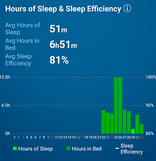
This graph shows the daily hours of wakefulness and the trends of sleep efficiency. If you're getting enough sleep on weekdays and free days and you maintain the higher sleep efficiency, the quality of sleep tends to be high.
- Bar graph (Left) shows the daily hours in bed and the hours of sleep.
- Line graph (Right) shows the sleep efficiency.
Hours of wakefulness & awakenings
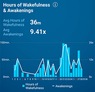
This graph shows the daily hours of wakefulness and the awakenings. If you are waking up a lot at night, the quality of sleep tends to be low.
- Bar graph (Left) shows the daily hours of wakefulness.
- Line graph (Right) shows the daily number of awakenings.
Sleep onset latency
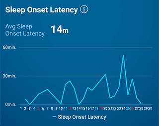
This graph shows the daily sleep onset latency (the time it takes a person to fall asleep). If you have trouble falling asleep, the peak of the graph will be higher.
Hours of snoring & volume
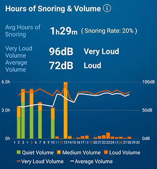
This graph shows the hours of snoring and its volume. The hours of snoring are color-coded into loud, medium and quiet volume.
- Bar graph (Left) shows the hours per snoring volume.
- Line graph (Right) shows the very loud volume and the average volume.
The evaluation will be carried out with the following 4 levels:
- Quiet
- Average
- Loud
- Very Loud